Recently, I found myself using popular marketing automation software to build a form for a client. I wanted to change the colors and styles of a form button. It was small, grey and not at all clickable. After some difficulty, I contacted support staff for assistance. The conversation went something like this:
Me: What’s the easiest way to stylize the form button?
Them: You can replace it with an image.
Me: And what other options do I have?
Them: That’s it.
Me: O.K.Wait, what?!
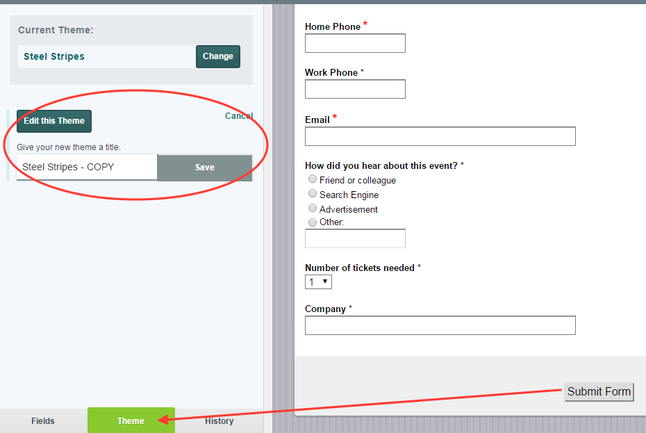
Well, that’s certainly not a best practice. I was surprised that such an advanced platform didn’t offer another solution for customizing call-to-action buttons. So we started using Formstack. Now it’s easy to change button styles and colors. And you don't even have to know advanced form button CSS to do it. (Although the option does exist if you want it). To start: Click on the submit button from within your form builder and select Theme at the bottom left. If it’s your first time customizing the theme, you’ll be prompted to name it:

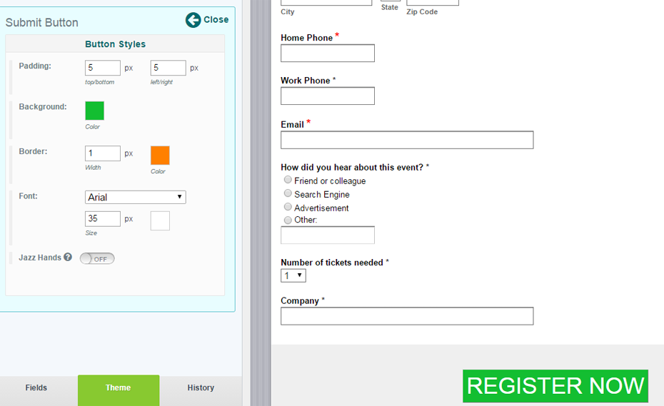
From here, you can edit your button's background color, border color, width, and padding:

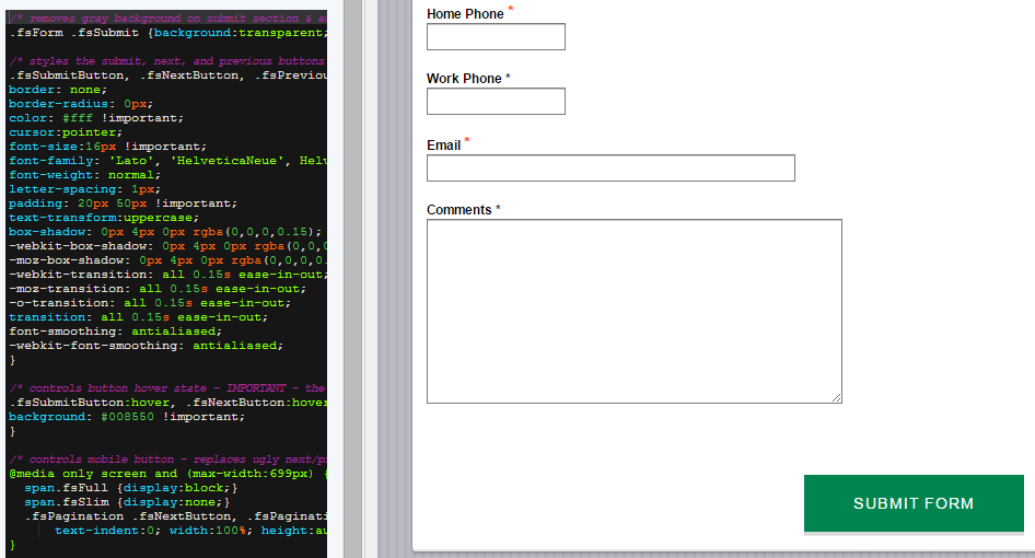
It’s seriously that easy. And if you’d like even more customizations, there’s always CSS (Cascading Style Sheets). Beginners can refer to Formstack’s handy CSS how-tos when trying out different classes and IDs.Of course, if you’re like me, you may want to just copy other successful CSS button styles and test your own changes. In that case, you can pick a form—any form—that has a button you’d like to copy into your Formstack account. Then go to Themes > HTML and CSS to copy everything you see under “Submit Buttons”:

And paste it into the Advanced CSS Editor within the form builder:


Now all you’ll have left to decide is what button copy to use. If you want to experiment, you can even A/B test different combinations.
Still have questions? Formstack's support staff has a wealth of submit button knowledge. And don’t worry—no one will suggest you simply use an image!


