Welcome to an official post from our Form Makeover Series!
Aermec, one of our awesome customers, was kind enough to submit their Formstack web form for a makeover evaluation. Let us tell you a bit about Aermec, and then we'll jump into the form makeover.
Aermec is an industrial air conditioning company based in Europe. They have been in business for over 50 years and serve both residential and commercial customers.Aermec sent us a neat form that (with conditional logic) allows their clients to see a description of their heat pumps. The form takes it a step further and allows you to receive information and a schematic for your project via a confirmation email.
What Changed?
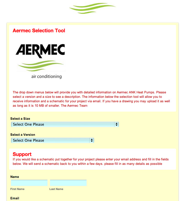
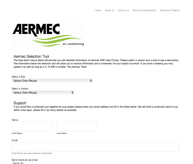
In the redesign, we've incorporated the header navigation that exists on the Aermec website. This gives the form theme a familiar feel and will help with abandonment rates. We've removed the yellow form background and red text to stay more true to the Aermec brand style and color set. We have also widened the form frame to 930px to mimic the sizing of the Aermec website. Lastly, we've softened the corners of the text input fields and styled the submit button to be large, bold and match the brand's green color.Here’s what the form looked like before:

And here’s the form, post-makeover:

Are you interested in having Formstack update your form? Follow the link here to submit your information, and we’ll be in touch! Any questions? Let us know!


